Improving iOS user experience by considering weather conditions in WeatherKit At WWDC 2022, Apple introduced the WeatherKit as a global scale hyperlocal forecast framework. It helps developers add valuable and accurate weather data to their apps and services on iOS 16, iPadOS 16, MacOS 13, tvOS 15, and watchOS 9. The framework is also accessible […]
Exploring The New Swift Charts from WWDC

Eibiel Sarjanto
July 12, 2022
4 Mins Read
How save time with the new Swift Charts feature in Swift
WWDC 2022 brought new updates to the community-beloved native language for the Apple environment. Swift is back with a lot of improvements and new capabilities to help developers deliver world-class apps with ease by enhancing swift charts for data. In this blog, we’re checking out the new Swift Chart framework to visualize and present valuable data to users across the iOS, macOS, iPadOS, tvOS, and watchOS.
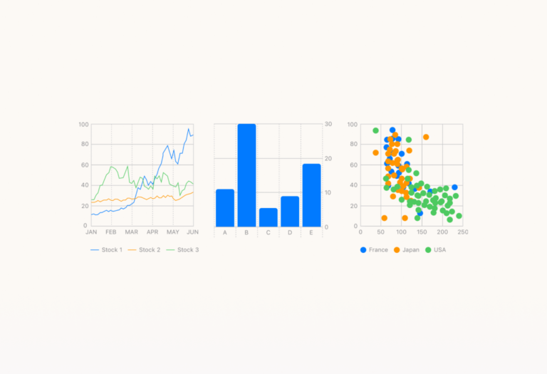
Swift Charts is the latest framework built on SwiftUI to transform data into informative and insightful visualization. It utilizes modern swift syntax to enable developers to create effective and customizable charts with minimal code. The framework itself provides a variety of charts such as: line charts, bar charts, and scatter plots, and it also supports animation and accessibility features to create intuitive and dynamic user experiences. We use swift extensively in our software development process.
Is it really as easy to use as they claimed in WWDC 2022? Let’s try it!
Note: In this guide, I’m using the beta version of XCode 14.0.
Creating sample charts
First thing first, we need a set of data for our chart. Since my workplace adopted a hybrid working policy, I want to know how often employees visit the office site.
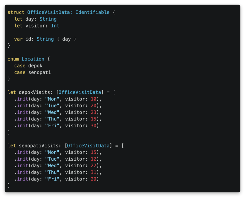
We made a data model containing a date and the number of visitors on that day as well as an enum for data selection. I initialized the datasets based on the 2 office sites of the company: one in the Senopati area and one in Depok.
Now we’re ready to present the data on a chart!
Presenting a set of data on a chart
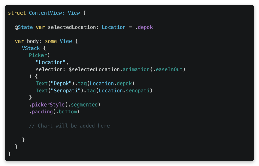
Let’s prepare a view with segmented tabs to let users alternate between the datasets. You can use this code for a basic implementation of the view.
Now, let’s add a bar chart below the segmented tabs to illustrate the number of office visitors using the code below.

The code simply passes and iterates the dataset into the `Chart()` API. We can see that each data is visualized into a bar using the `BarMark()`, and we only need to assign the data values to the chart axis. Just like that, a useful bar chart is created!

See how the graph beautifully transitions to each dataset. Remember that the framework is based on SwiftUI, so you can use animations for a smoother user experience.
Looking at a bar chart for an office is cool, but what if we want to compare between the offices visually?
Presenting multiple sets of data on a single chart
Let’s merge the sets into a sequence of series data.
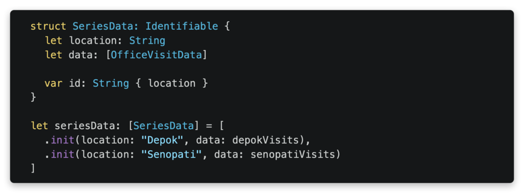
Now let’s replace all components in our `body` with a new chart to present our series data.

In the code above, we iterate the series of datasets in the chart and iterate the dataset’s values using `ForEach()`. And then we set the `.foregroundStyle()` of the chart to assign a color for each value automatically. Overall, the code is not too different from our first bar chart, right?

The current chart is useful to see the total number of visitors from both branch offices. But what if I want to compare the numbers instead? We can change the chart design easily by modifying a single line of code! Simply change the `BarMark` into `LineMark` like the example below:


And there it is! An insightful line chart to compare the number of visitors for both office sites. Although, it seems a bit hard to make out the exact data without any emphasized points on the chart, is it?


By adding the single line of code above, now the line chart is easier to read with highlighted points! Pretty useful chart to compare the number of visitors, don’t you think?
You can check the full sample code project here
https://github.com/Ice-House-Engineering/blog-ios-chart
You can check the full sample code project here
What’s next?
In this blog, we experimented with a bar chart and a line chart using the new framework. But we know the Swift charts can do much more! So go ahead and try experimenting with other designs and add informative visualizations for your app! Cheers!
References
Written by
Eibiel Sarjanto
More Articles
Eibiel Sarjanto
July 6, 2022
4 Mins Read